How to create a buttonless bot
Replace your chatbot’s buttons to avoid it breaking soon
Does your chatbot live on Facebook Messenger? If so, it might stop working properly because of Facebook’s most recent API updates. In this article, I’ll explain how to deal with the changes and create a buttonless bot that works, no matter what Facebook does!
To button, or not to button? That is the question.
But not when it comes to Facebook.
On November 30th, Facebook announced they are updating their Messenger API to comply with European privacy laws, which will impact many of the 300.000+ chatbots that currently live on this platform.
If your Facebook page and bot users fit the criteria listed here (such as being located in Europe), users will no longer be able to see bot messages that contain:
- Buttons
- Carousels (also called generic templates)
- Quick replies — update: these might actually stay
- Any media other than images — such as video, files, audio
So that’s the bad news. The good news is that you can easily avoid all of the messaging types above by cleverly using intents, context and other conversational design tricks. And if you think about it, we have all these new, smart devices that we can use in almost any way we choose. But out of laziness or lack of innovation, we continue to force users to click a tiny little area just a few pixels wide..
Let’s do something about it. Let’s go buttonless!
1. How to avoid buttons and carousels

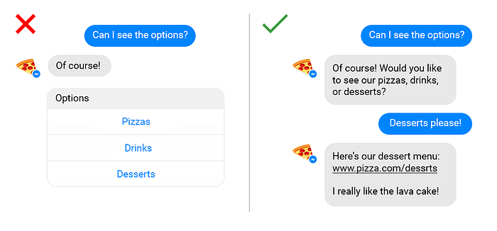
You can easily replace buttons by using a combination of match entities and input validation. For example, when the user places an order, the bot can check in a predefined list of available menu items if this order is indeed possible. Sure, you’ll need to create a few extra steps, but it almost makes it more conversational this way.
Using a button to show a URL? Simply turn it into a message containing that same URL. Sure, it’s a few extra steps and it doesn’t look as good, but it makes no difference in the end. In fact, it’s so much more conversational!
Carousels are a way to visualise options by using images and buttons. Each option can have up to three buttons, which are the same as any other buttons.
2. How to avoid quick replies

Instead of showing quick replies, you can add the options to your text message. Create an entity (for example, @shirt.size) and add all possible values (small, medium, large), so your bot is able to detect the correct value.
3. How to send files

Instead of sending the PDF to the user for download, you can host it on any file hosting service like Dropbox, Google Drive, WeTransfer etc. This way, the user can view the PDF in their browser.
ps: Chatlayer.ai recommends a max. size of 5 MB for media files shared on Facebook Messenger, as Facebook seems to struggle with files larger than that.
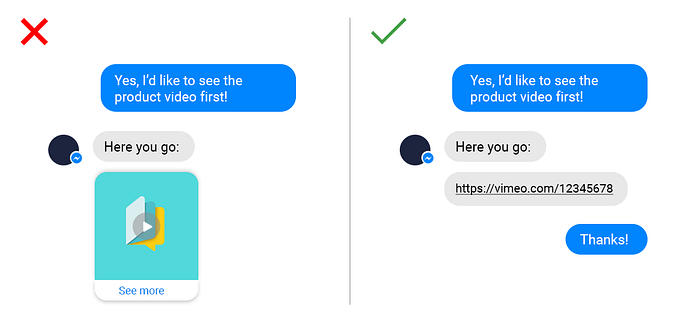
5. How to use videos and audio

I know, the video thumbnail on the left looks better visually, but when it comes to the actual conversation, nothing really changes. The user still has to click on the bot’s message, it just looks a bit different. And instead of the video being played inside the conversations, users will be redirected to an external website.
Do make sure to create an intent for ‘see product video’ so the bot knows what to do when the user states this type of intent.
To wrap it up
Sure, buttons are handy and fun. I love a good button myself! But if your bot lives on Facebook Messenger, you should skip them all together. Having a buttonless bot protects it from breaking every time Facebook decides to update their API.
Besides, a chatbot’s main purpose is and always will be to imitate a real-life conversation with people. And there’s no buttons in real life anyways. 😉
Hi there, I’m Tess, language lover and taco enthusiast! Currently Conversation Design Lead at Chatlayer by Sinch, I like to write about the things I learn and see when building multimodal bots.
Interested in knowing more about voice and chatbots? Want to swap ideas or talk conversation design? Reach out to me on Twitter!
